Content Guide
For more information on colors, button types, and icons available on this site, please see this guide.
Paragraphs
Paragraphs are reusable structured blocks of content that can be added to subpages within each Drupal site.
Body Content
Use this paragraph type to add basic body content.
Airline (Directory)
Use this paragraph type to add an airline to the directory.
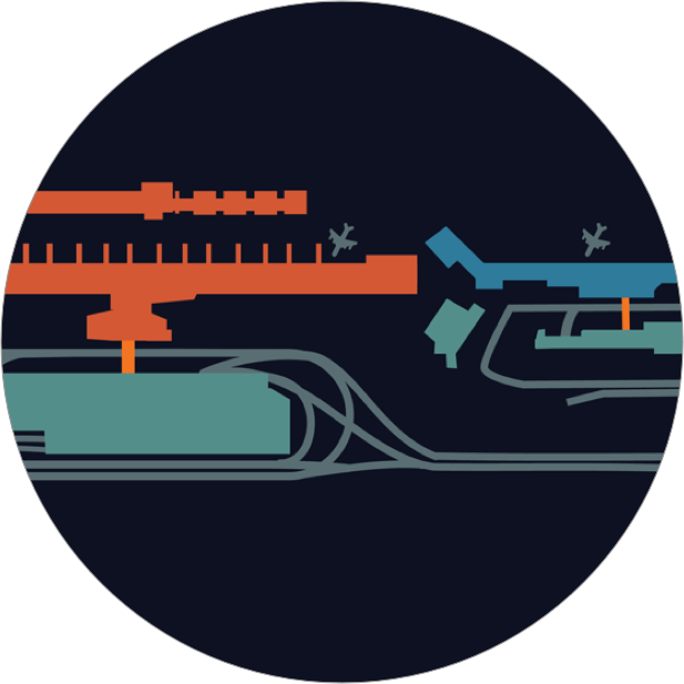
Evans Terminal
Reservation Number:
Baggage Service Number:
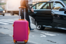
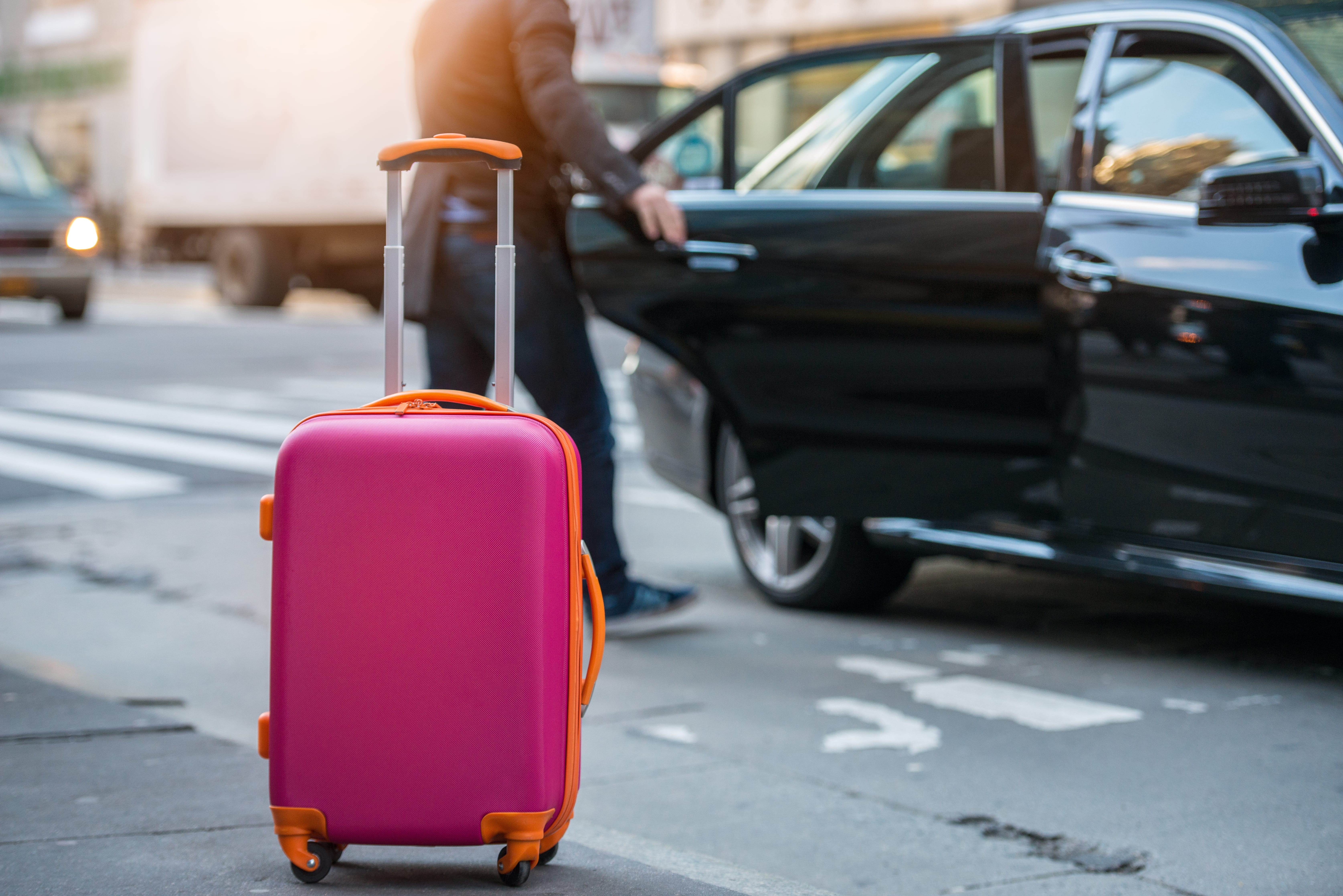
Left Image + Content
Use this paragraph type when your content is accompanied with an image.

Text goes here.
Centered Content with Background Image
Use this paragraph type to draw attention to an important callout.
Title
Callout text
Four Image Callout
Use this paragaph type to group four related callouts together.
Callout Block Title


Full-Width Callout
Use this paragraph type to draw attention to an important callout. This option works well for breaking up content sections and gives the page a polished look. There's also an option to add a button.
Link Button
Use this paragraph type to add a button link. See the Buttons section in the Pattern Library for more options.
Button Type/Color options available through Drupal:
- Large
- Wide
- Outlined
- Button with icon
- Translucent
- Transparent
- Without border-radius
- Without left border-radius
- With chevron
- Blue
- Green
- Orange
- With right triangle
Link Button Group
Use this paragraph type to group related links together. You can set the color, shape, size and alignment of buttons.
Maps Callout
Use this paragraph type to provide links to all terminal and campus maps.
Title
Multi-Column Rounded Image Callout
Use this paragraph type to add side-by-side image callouts.
Title #1


Parking Rates Table
Use this paragraph type to display parking rates. If multiple tables are created, they will float side-by-side.
| Time | Rate |
|---|---|
| $3.00 | |
| $4.00 | |
| $5.00 | |
| $23.00 |
Add additional notes here
Q&A
Use this paragraph type to add question and answer (Q&A) blocks.
Well, this is the answer.
Three Column Content
Use this paragraph type when you have three sections with roughly equal content. Each column has its own callout button. A border can be placed below each heading or above the entire group.
Title 1
Detroit Metropolitan Airport (DTW), along with Willow Run Airport (YIP) comprise one of the world’s leading air transportation hubs with awesome potential for growth and development.
Title 2
Detroit Metropolitan Airport (DTW), along with Willow Run Airport (YIP) comprise one of the world’s leading air transportation hubs with awesome potential for growth and development.
Title 3
Detroit Metropolitan Airport (DTW), along with Willow Run Airport (YIP) comprise one of the world’s leading air transportation hubs with awesome potential for growth and development.
Three Column Image Background Callout
Use this paragraph type when you have three related callouts with an accompanying image. Each callout must have an icon. This paragraph type does not have a field for additional content.
Three Image Callout
Use this paragraph type when you have three callouts with their own accompanying image. The image caption is a hyperlink.


Two-Block Image Background Callout
Use this paragraph type when you have two callouts with their own accompanying image.
Two-Column Callout
Use this paragraph type when you have two callouts with icons and accompanying content. You have the option of choosing the color of the icon. If a color isn't specified, it will default to the color of the text in the same paragraph.
Title
Detailed text
Title
Detailed text
Two-Column Content
Use this paragraph type to format content into columns. These columns can be set at an equal 50/50 ratio, or one column can be wider than the other to create a different affect (60/40).
Two 50% columns with white background
A title is here
This is the content that appears in the first column.
Two 50% columns with white background
Another title here
This is the content that appears in the second column.
Two 50% columns with gray background
A title is here
This is the content that appears in the first column.
Two 50% columns with gray background
Another title here
This is the content that appears in the first column.
60% white column + 40% gray column
A title is here
This is the content that appears in the first column.
60% white column + 40% gray column
Another title here
This is the content that appears in the second column.